Schools Project
- Apr 4, 2019
- 4 min read
For our client project this year, I was trying to decide which project to go for when I came across a local school who had just rebranded their outlook. The school is one of the lesser performing schools in the country, and so they had decided to have a change. The school rebranded with three main words, which were 'Respect, Believe and Achieve'.


The actual school building had this work done to it and also things like the website and curriculum.
My goal was to create a short film for each word, showing a way in which the word could be achieved. I found this quite difficult to begin with as none of the words initially bring an illustrative image to mind.
To get a wider knowledge of what the school wanted, I decided to do a short survey to ask people. The questions were very basic, like 'What is the first thing that comes to mind when you hear 'respect'?'. The responses were varied, but I had things such as 'grandparents' and 'friends' when asked about respect. This is what gave me the idea to use lots of different people for the respect film.
I decided to do two shaking hands which are constantly changing and show the idea of respect between two people. This fit with the school's motto of everyone being included, despite gender, race or any other diverse features they encompass within the school.
I am happy with the final outcome, and I think the song works well too.
The school is very focused on students achieving things which are important to them, and not just about grades on an exam certificate. Because of this, I thought it was really important to show images which didn't show someone completing an exam or a written piece of work.
I used a medal as it is a world wide recognition of achieving something, but didn't put 1st or 2nd place as I wanted it to be known that achievement is what you make it, and this really fit well with the schools values.
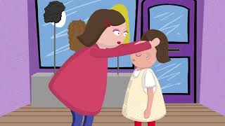
The last film was the believe one. This was the trickiest film to come up with an image for as most connotations of the word are to do with religion. Although the school is a diverse one, they didn't want to have the image to do with religion, instead more to do with believing in yourself. The headteacher said to me, 'a lot of it for these kids is to do with belief in themselves. Once they find someone who believes in them, they start to do it themselves and that's when we see the changes'. I really wanted to work with this and make a difference for the school, and so this was the longest film I made. I also did some character design, and made more a storyline to it than the other 2 films.


I also made a basic animatic to show the timings for the film and give myself something to work towards. This helped me for the final film.
I am happy with the outcome of this film, however if I could change a few things with more time, then I would. The first of this would be when the character trips and falls. I would like to work on that a bit more so it looks more realistic and he doesn't look so much like he is tripping on flat ground, and more that he is falling downhill. I also think when he is walking uphill, his feet slide a bit down the way. I know this could be easily corrected by just fixing a few frames but I also quite like the look of it, as if he is sliding with each step but carries on anyway.
I think the message is put across quite well in this film, and the school were very happy with the outcome.
The videos are designed so that they can all be played separately, or they can be played as one. This fit the brief as the headmaster asked for them to be able to be played on the plasma tvs in the canteen during break and lunch time, and also so that they can be used during presentations and talks to prospective and current students. As they needed to be played on the plasma tvs, there couldn't be any talking by the characters as they sounds would get lost among the chatter and noise of school pupils. I also managed to maintain the 3 separate colours throughout the films, which was very important to the school as it is their 3 school house colours and they want each word to be strongly associated with the colour. I thought the easiest way to do this would be to have the backgrounds be the colour the word is associated with, and it worked out pretty well in the end.
I really enjoyed this project and it was nice for a change to work on a slightly more serious topic than the project in semester one, which was the Beano one. I will look to work on similar projects to this in the future.


Comments